top of page

De Dutch Pannekoek House
How can De Dutch rejuvenate their brand?
De Dutch is an incredible breakfast and lunch restaurant that can make all of your wildest pancake dreams come true. Well, actually all of your wildest "pannekoek" dreams. This brand had such a rich history that I felt could be showcased in a refreshed way that felt approachable and modern in order to capture a new generation of pannekoek lovers.
Branding | Art Direction | Illustration | Design | Typography
Done while at Saint Bernadine
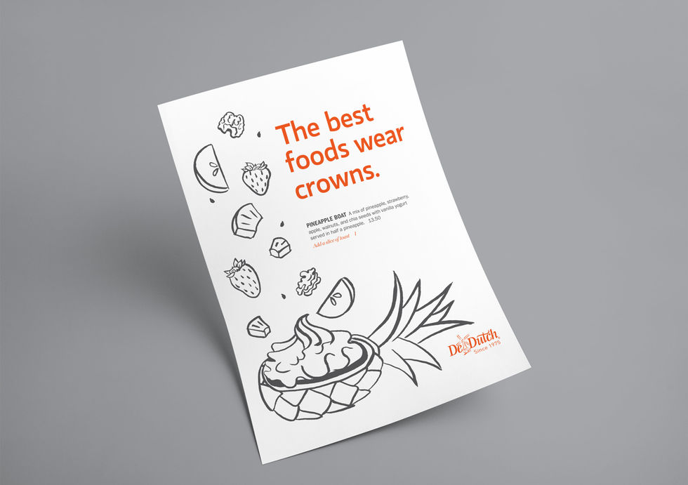
This illustration style was hand-crafted to bring a modern yet personal twist to De Dutch's history in a loose playful way.

In order to roll out this brand refresh, I designed a whole set of new collateral such as menus, feature sheets, BOGO vouchers, and more.
De Dutch? De Digital.
When a friend's birthday comes up, I've taken to making a custom card for them, so I was honoured when De Dutch asked me to do the same.


For their anniversary, it only made sense to celebrate all the memories that come from 45 years of experience with a custom calendar and social media posts to match.
This anniversary was so special it called for a wardrobe change.

When COVID-19 hit and everyone had to work from home, De Dutch was forced to temporarily close it's doors. In the meantime, one of their mascots known only as Eggbert, the free-running egg, could no longer run free. He was cooped up at home just like the rest of us.

P.S. The photoshoots were absolutely delicious.

bottom of page


